With that said, I'll get right down to the goods.
Chromium OS. Some time back, I promised a review of Chromium OS.

The long and short is that it's pretty cool to be on the bleeding edge, but it's pretty slow and, frankly, outdated. I assume a lot of slowness had to do with the fact that I ran the OS off a USB drive, but it was slow, I mean molasses, compared to Chrome on my HP machine. Unless you're going to download the OS to a netbook, I definitely wouldn't recommend you try this any time soon (especially considering I also ran it off my old Acer to see if it would be any faster - it was, BUT - in a cumbersome process, I had to download some third party software so I could boot from USB . . . it definitely made me feel not as techie as I style myself). However, if you, like I did, just want a taste of the future, give it a whirl and hit me up with any preguntas.
New Dev Updates. Chrome continues to amaze me. I'll get into just three recent features here: 1) It's not the biggest deal ever, but the dev channel (at least) now has a little orange/yellow ball that appears on the wrench icon whenever a new update's ready to be installed. Yes, Chrome would probably just update on it's own anyway, but I'm pretty OCD about new updates (just ask my wife . . .). 2) Consolidated wrench/page icon menus. This was something that always confused me: why have two different menus, when their lists are practically indistinguishable? Again, not a huge deal, but it does save some more space (which everyone loves) and helps avoid some confusion. 3) I think I've already talked about Chrome's newly built-in pdf viewer, but I can't tell you enough how much I love it. Adobe's plugin always bothered me with how clunky it was and how it got in the way of browser shortcuts, etc.
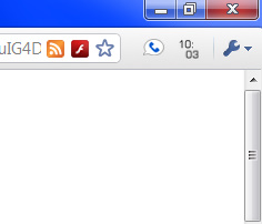
Update: Here's the orange update notifier I told you about.

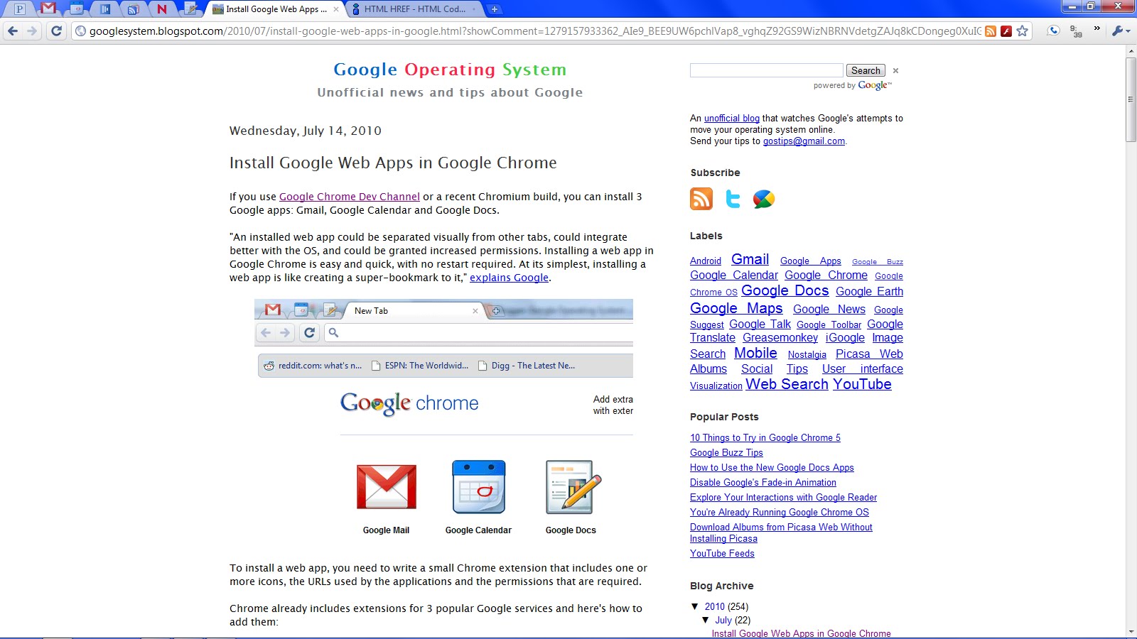
Web Apps. I found out about this little gem tonight (which, incidentally, inspired this post), on the unofficial, Google Operating System blog. Not a ton to say here, but that the "web app" icons look a lot better and the toolbar is removed on the web app pages. You'll need to be on the dev channel and read Alex Chitu's guide (in the previous link) on how to install them, but they've worked great for me so far, and I look forward to continued developments. NOTE: You can just barely see the new icons in my browser tabs 2, 3, and 7.
Happy Chroming!
2 comments:
I like the yellow ball by the wrench thing. It's nice to not have to check to see if there are any updates, but it tells you instead.
On a side note, I think that you should make your type either average gray or light gray. White text does something funny to the eyes. I can't remember what they taught us in my "color" (whoo hoo) class, but it's a start Daniel, it's a start.
Thank you, Gilderoy, hopefully it looks better now.
Post a Comment