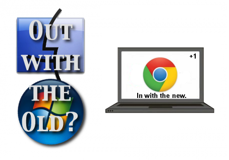
I have a lot of mixed feelings, here. On the whole, I think I'm disappointed with how the OS has changed: I feel like a lot of precedence has been given to making the system feel like a traditional OS, rather than to ease of use . . . It's almost as though Google got freaked out it was too forward thinking and had to take a few steps back to a desktop-like feel.
Before, I could easily see what time it was, what my battery/network were like, and even if I had caps lock on. Now, if I want to see those things, I have to dedicate a solid chunk of my screen or flip my mouse down, anytime I want to see them (thank goodness for extensions like Cool Clock).
Why move the apps section to a spot only on the launcher? I liked before, how it was right on my new tab page, ready to go. I feel like I'm taking a step back, having to go all the way down to the tile icon, rather than typing ctrl+t.
 |
| Is the reworked OS a step forward or, ironically, a step backward? |
What happened to the keyboard shortcuts to re-size windows?
WHAT HAPPENED TO PANELS??!!? Panels were one of my favorite parts of Chrome OS. I gather that whole concept's been jettisoned. WHY OH WHY?
This is a smattering of my initial reactions. Maybe things will change or maybe I'll get used to the newfangled-ness.
At the end of the day, I feel like I'm using a glorified Linux without the native applications. What gives, Google?
Am I simply having a knee jerk reaction, or has anyone else had similar reactions?

1 comment:
I have diferen feeling, I love Chrome OS new design!
Post a Comment